Huge thanks to designer, artist, and creative Ron Logan for providing some insight into his work rebranding CoSA!
CoSA Rebrand: A Bit About The Process
In July of 2019, I was asked if I would rebrand Coronado School of the Arts. I said “Yes,” of course.
Like all my projects I began with the scope of work and budget. Is it just a logo? Or is it more?
Many of my projects are simple logo creations. Other projects are comprehensive, like the 2003 FIFA Women’s World Cup, which included designing and branding (but NOT logo development). FIFA supplied the official event logo and game program, but everything else was me. That included designing the motif of the event, choosing the colors, then designing ticket stock, media guides, press credentials, stadium dressing, banners, directional signage, print ads, web graphics, and the official event poster. My work covered six stadiums, in six major U.S. markets. I had three months to complete it start to finish (usually the design team gets four years or more). That was a lot of fun. And a lot of work.
For CoSA, the scope was far narrower than the Women’s World Cup, and the timeline was far more relaxed. But, I was still anxious to get started.
I start my projects with research. In the same way you should know all you can about an employer before you arrive for your job interview, the same applies to graphic design. Start the project with as much specific knowledge about the project as possible. The more I knew, the better I could do my job.
So, I dove in and learned about CoSA, about other regional performing arts schools, and about similar schools around the world. I researched the history of CoSA and its relationship to Coronado High School, about the CoSA curriculum, and the Foundation.
Based on my research I did a visual audit of all the logos (put them all on a page and compared them). I noted the logos I felt were most effective and clever, and I studied the similarities and differences. That gave me a good idea of how to best fit into the market but also how to be unique compared to what already exists. I looked at style, color, recurring themes, overused themes, imagery, fonts, and trends.
Research is important. It also meant barraging Beth Connelly with myriad questions about everything: What are the school colors? Do you have a tagline or motto? Do you have a mascot? Does the physical building have any unique features that could be abstracted and refined? Does CoSA want to be conflated with the Coronado Bay Bridge or Hotel del Coronado or do you prefer to distance yourself from those icons? Are there any famous people connected with the school like Theodore Geisel, or Ellen Browning Scripps? Does CoSA use any of the CHS icons? Green and white colors? Islanders name? Do you want to look affiliated with CHS or do you want a unique identity that is divorced from CHS? Should the CoSA Foundation branding have any effect on the CoSA school brand? Who does CoSA view as their competition? How do you see the logo being used? Signage? Letterhead? Business cards? Apparel? Billboards? School vehicles? Is there one area of discipline that is larger than all the others? Who is your audience? What do you want to accomplish in reaching them? What kind of sales pitch are you considering? Is this to donors? Potential students? Corporate sponsors? The community in general?
Yeah, it is a lot of back and forth, and a lot of research, but when done correctly, my time spent developing the new brand is so well-informed by the previous questions and answers that I already have ideas and concepts in my head by the time I put pen to paper (or stylus to graphics tablet).
Throughout the process I thought about CoSA’s six categories of study: Dance, Digital Arts, Music, Theatre, Theatre Production, and Visual Arts. Although it would be a mistake to develop a logo for each discipline, I considered how to weave aspects of all of them into the final logo so that all students and areas of focus were represented.
I thought about the history of the logo, and specifically about a request to maintain the image of the bridge. After first exploring the idea of using the bridge, I realized the name ‘Coronado’ communicated the same elite aspect that was found in the bridge image. When I saw the bridge, it suggested Coronado, but the WORD Coronado communicated that more concisely. So, I leaned toward a ‘CoSA’ logo with the ‘Coronado School of the Arts’ in text. With time, the logo will be recognizable without the need for the words. But it had to be unique.
I also considered the idea of using a crown in the logo. It was elite, is featured in the hotel ballroom, and is the root (Corona) of the word ’Coronado.’ Plus, an abstracted crown could work very well in a logo as it is simple and bold and won’t have the problem with detail like the bridge. But I couldn’t find a way to justify its inclusion with the CoSA letters I was beginning to envision. It didn’t seem to belong. It seemed forced. It seemed the opposite of art and creativity.
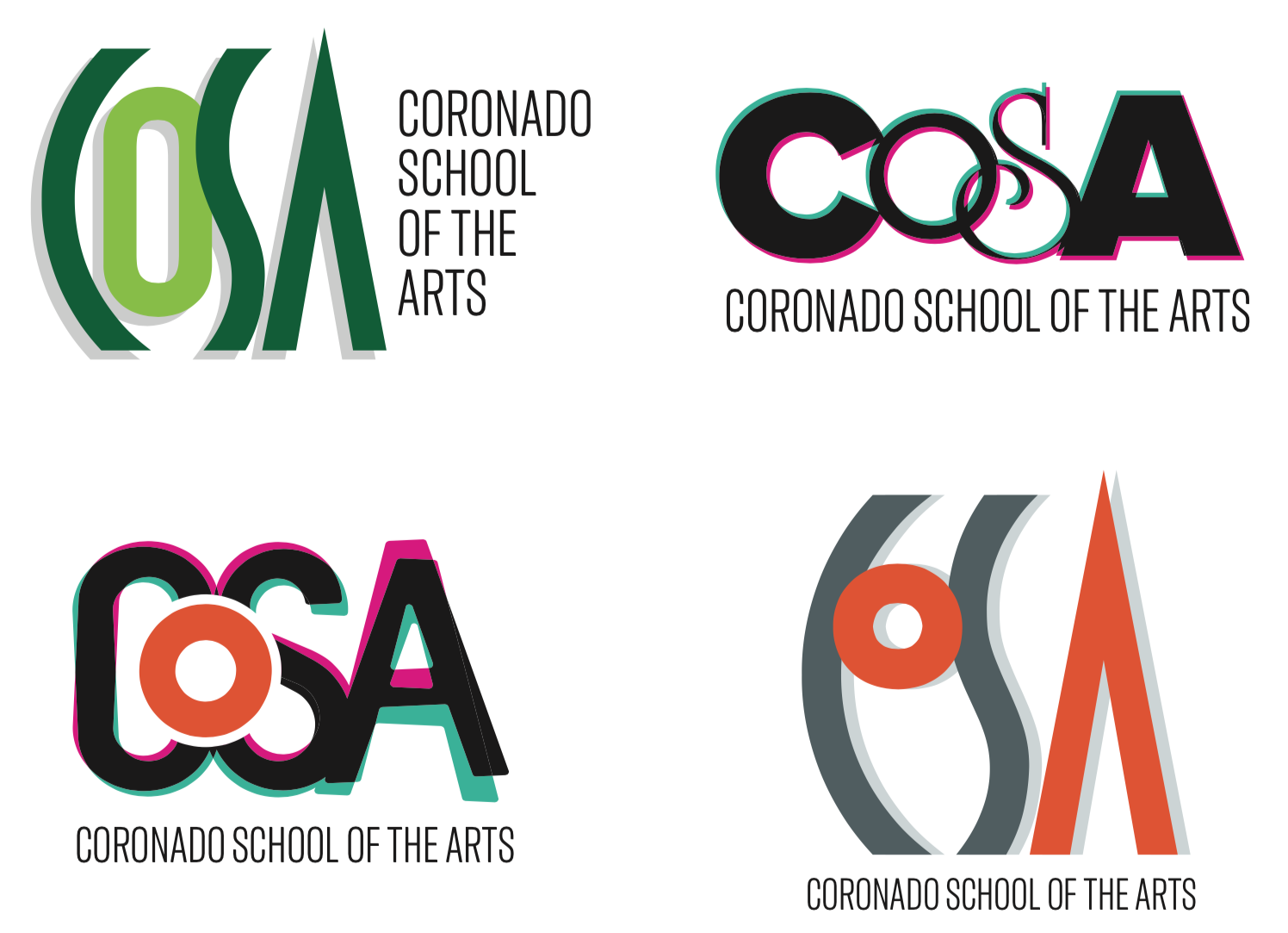
After a many hours at the computer, I developed four concepts as a starting point.
For these first four options I chose to use variations of the color green, because of the Coronado HS colors; variations of orange, because of the physical closeness of CoSA to Orange Avenue, the main artery of the island; and variations of black and gray as they are complementary to most colors. I settled on the darker cool gray, a particularly perfect color as it is basically Navy Gray, a color that is historically embedded in Coronado.
In the bottom two logos, I experimented with using an Orange O as in Orange Avenue. In the bottom right, an eye emerged from the shapes made with the CoS, and the A was suggestive of an up arrow: rising, up, top, above, improving, progressing. This had potential. So, the bottom right logo became the foundation for the final logo.
From that basic concept, I gave the letterforms meaning beyond their value as alphabetical letters. After a couple rounds of feedback and minor edits, the final logo had emerged.
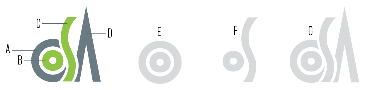
Explanation of the final elements:
The logo consists of four distinct elements which work independently and in conjunction with the other elements. The colors are a cool slate gray and yellow-green. The yellow-green is a currently popular shade of green, and green is an homage to the CHS color. The gray is an excellent complement and is also a currently popular color. The gray is an homage to Navy Gray, the color you see on all the U.S. Navy vessels at North Island. I have included orange as an accent color that does not appear in the logo itself but can be used in conjunction with the logo.
A – This is the letter C for “Coronado” and is a portion of a perfect circle, one of the basic elements of design.
B – This is the lowercase “o” for the second letter of “Coronado” and is a complete perfect circle, a basic element of design and a recurring shape in The Arts … a circle can be a face, a head, an element of design, the world, the sun, a planet, wholeness, completeness, the universe, everything, original perfection, the Self, the infinite, eternity, timelessness, all cyclic movement, God. it represents a whole note in music, the lens in theatre lighting instrument, a closed circuit in electricity and electronics, the head of a drum, the bell of a trumpet, a cymbal, the lens of a camera or videocamera, and the most basic shape to appear in visual and digital design.
C – The letter S is for “School” and is an elegant, almost-human form. The shape represents the curves of a body, the elegance of a dancer, grace of an actor, a representation of motion. It appears to be flowing and is supported by the C. It has an almost flamelike quality to it, like a fire of creativity.
D – The triangular shape is the A of “Arts” and also an arrow pointing up. The arrow suggests moving up, ascending, improving, reaching for the stars.
E – The first two elements, the C and o, work together to form the Co of Coronado, but also create a target (maybe a goal for students to reach, a standard for educators to attain), and it is also a representation of a fresnel lens in theatre lighting, and an eye.
F – The o and S work together (and are the same color) to form a stylized musical half note or quarter note.
G – Together, the four elements spell “CoSA” but are also representative of an abstract and stylized design, whether digital or visual, that could be a painting, a sculpture, a pendant, a piece of scenic design on stage in a play. The letters start shorter and ascend as they move from C to A, with the A arrow being the tallest shape the overall feel is a climb or ascent in life, education to a higher standard. An evolution.
Best,
– Ron Logan